WHY WE LOVE DARK WALLS AND YOU SHOULD TOO

So why do we love dark walls and think you should to...
We have totally fallen in love with the dark walls trend. If you've been thinking about joining the dark side here are our insights and tips to get you started.
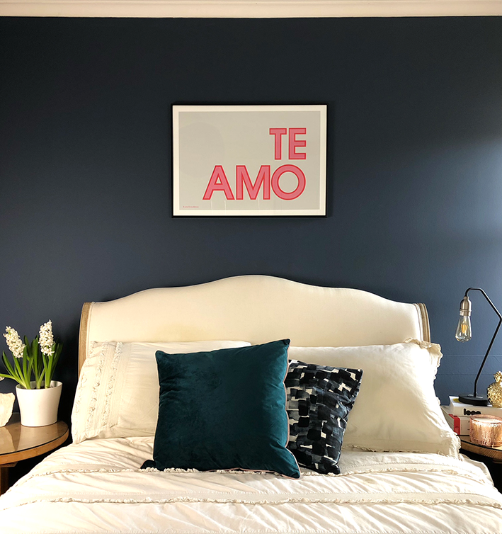
When I first thought of painting a wall in our bedroom dark blue I have to admit I was a bit worried that it might be too dark or strong for the room? In the end, though we are so happy with the results. We settled on Stiffkey Blue from Farrow and Ball which is a bit more expensive but their colour palette is much more interesting than cheaper brands. I've also read that the reason they are more expensive is that the pigment they use is of a much higher quality so it goes further in coverage. We only painted one feature wall, and it has given the room a real sense of depth. Best of all our beautiful cream COCO bed from Loaf, has been really set off, whereas it was a bit lost before against the white wall. So don't be overly concerned about the size of your room when considering bold and striking colours, the effect it generally has is of opening it out and highlighting features you already may have. I recently hang our latest typographic 'Te amo' print on the wall and really stands out against the deep dark blue.
I did some research beforehand and found lots of beautiful rooms where other people had used this colour and had really worked for them. This finally convinced me even more to just go for it. It took us three coats to get it deep enough but you can sometimes get away with two if the strength isn't too different to the one already there.
 Doodlemoo office dark grey wall
For my studio I chose two walls with 'charcoal grey' from Farrow and Ball, with white shelves and the rest of the room is white. This means i can have enough light for working and designing plus the contrast makes the room look cool.
Doodlemoo office dark grey wall
For my studio I chose two walls with 'charcoal grey' from Farrow and Ball, with white shelves and the rest of the room is white. This means i can have enough light for working and designing plus the contrast makes the room look cool.
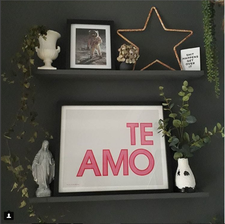 Te amo grey wall
Here on Styling York Pretty's sitting room wall Natasha has used B&Q colours premium charcoal matt paint, which can be painted in any room and on any surface. She says "I love this range as it can be used on wood and metal so I painted my radiators so they blend into the dark wall. Plus it's quite reasonably priced" You can see our 'Te amo' grey background print here styled to perfection on this shelfie.
Te amo grey wall
Here on Styling York Pretty's sitting room wall Natasha has used B&Q colours premium charcoal matt paint, which can be painted in any room and on any surface. She says "I love this range as it can be used on wood and metal so I painted my radiators so they blend into the dark wall. Plus it's quite reasonably priced" You can see our 'Te amo' grey background print here styled to perfection on this shelfie.
 Gallery wall with our 'Te amo' print Styling York Pretty
The landing in the photo above is a mixed Valspar paint. Natasha also says "I chose an off black deep grey and had it mixed for me". I think this looks so great and makes the prints and pops of colour stand out. Check Styling York Pretty Instagram feed here.
Gallery wall with our 'Te amo' print Styling York Pretty
The landing in the photo above is a mixed Valspar paint. Natasha also says "I chose an off black deep grey and had it mixed for me". I think this looks so great and makes the prints and pops of colour stand out. Check Styling York Pretty Instagram feed here.
 AStylebird mirror and dark wall
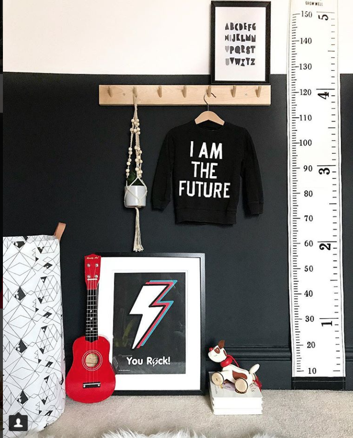
Here at A Style Bird's home, Libby is the queen of the dark walls! I love how her mirror looks against the deep blue colour she has chosen from Farrow and Ball. She has also used dark grey colours for the walls in her kids bedrooms and styled them with colourful furniture, bright shelves, super bright yellow chair and some of our prints which makes them all really pop out. I specially love her daughter's bedroom with our 'Love Struck' print and the accents of pinks and yellows she arranges in them. The grey colour in the daughters room is Charleston Grey. On her boy's room the colour is Down Pipe and again i love how the yellow elephant shelf and our You Rock print accentuated.
AStylebird mirror and dark wall
Here at A Style Bird's home, Libby is the queen of the dark walls! I love how her mirror looks against the deep blue colour she has chosen from Farrow and Ball. She has also used dark grey colours for the walls in her kids bedrooms and styled them with colourful furniture, bright shelves, super bright yellow chair and some of our prints which makes them all really pop out. I specially love her daughter's bedroom with our 'Love Struck' print and the accents of pinks and yellows she arranges in them. The grey colour in the daughters room is Charleston Grey. On her boy's room the colour is Down Pipe and again i love how the yellow elephant shelf and our You Rock print accentuated.
 Heart print Love struck in a girls room
 Elephant Shelfie and You Rock print
 'Te amo' pink print on astylebird's blue wall
 Tote bag with 'Love Struck' design from Doodlemoo
I love The house that Jen built, her instagram feed is so beautiful and she mixes dark walls with super bright ones and spaces. Also her charcoal fire places just look stunning. In her boy's room she has painted half of the wall dark grey covering the fireplace to match which contrasts with the white gallery wall above. This alternative is great if you feel like the whole wall is too much and also to have the choice of playing with art work or prints.
Tote bag with 'Love Struck' design from Doodlemoo
I love The house that Jen built, her instagram feed is so beautiful and she mixes dark walls with super bright ones and spaces. Also her charcoal fire places just look stunning. In her boy's room she has painted half of the wall dark grey covering the fireplace to match which contrasts with the white gallery wall above. This alternative is great if you feel like the whole wall is too much and also to have the choice of playing with art work or prints.
 Dark wall sitting room at The house that Jen Built
 'You Rock' print. Boy's room The house that Jen built
 Boys room wall styled by Jen from The house that Jen built
Most importantly you should choose the colour you will be happy with for some time!, as trends can change so quickly, it is great embracing the trends and adding them in our own way.
You can see how our Doodlemoo art prints look so well on the dark walls, I think I will be painting my boys' bedrooms next, maybe a half wall. Watch this space! We hope you found this article helpful, leave us a comment bellow, we would love to hear your thoughts and if there's any other interesting subjects you would like to see here!
Thank you to A Style Bird, Styling York Pretty and The house that Jen built for the great photos and styling with our prints. Shop prints here.
Boys room wall styled by Jen from The house that Jen built
Most importantly you should choose the colour you will be happy with for some time!, as trends can change so quickly, it is great embracing the trends and adding them in our own way.
You can see how our Doodlemoo art prints look so well on the dark walls, I think I will be painting my boys' bedrooms next, maybe a half wall. Watch this space! We hope you found this article helpful, leave us a comment bellow, we would love to hear your thoughts and if there's any other interesting subjects you would like to see here!
Thank you to A Style Bird, Styling York Pretty and The house that Jen built for the great photos and styling with our prints. Shop prints here.
Doodlemoo office dark grey wall Te amo grey wall Gallery wall with our 'Te amo' print Styling York Pretty AStylebird mirror and dark wall Heart print Love struck in a girls room Elephant Shelfie and You Rock print 'Te amo' pink print on astylebird's blue wall Tote bag with 'Love Struck' design from Doodlemoo Dark wall sitting room at The house that Jen Built 'You Rock' print. Boy's room The house that Jen built Boys room wall styled by Jen from The house that Jen builtContinue reading


Comments
Be the first to comment.